![]() Feb 8
Feb 8
Counting Tweets in R – Substrings, Chaining, and Grouping

I was recently sent an email about transforming tweet data and presenting it in a simple way to represent stats about tweets by a certain category. I thought I would share how to do this:
A tweet is basically composed of text, hash tags (text prefixed with #), mentions (text prefixed with @), and lastly hyperlinks (text that follow some form of the pattern “http://_____.__”). We want to count these by some grouping – in this case we will group by user/character.
I prepared a sample data set containing some made up tweets by Sesame Street characters. You can download it by clicking: Sesame Street Faux Tweets.
Fire up R then load up our tweets into a dataframe:
# Load tweets and convert to dataframe tweets<-read.csv('sesamestreet.csv', stringsAsFactors=FALSE) tweets <- as.data.frame(tweets) |
We will use 3 libraries: stringr for string manipulation, dplyr for chaining, and ggplot2 for some graphs.
# Libraries library(dplyr) library(ggplot2) library(stringr) |
We now want to create the summaries and store them in a list or dataframe of their own. We will use dplyr to do the grouping, and stringr with some regex to apply filters on our tweets. If you do not know what is in the tweets dataframe go ahead and run head(tweets) to get an idea before moving forward.
gluten <- tweets %>% group_by(character) %>% summarise(total=length(text), hashtags=sum(str_count(text,"#(\\d|\\w)+")), mentions=sum(str_count(text,"@(\\d|\\w)+")), urls=sum(str_count(text,"^(([^:]+)://)?([^:/]+)(:([0-9]+))?(/.*)")) ) |
The code above starts with the variable we will store our list in … I called it “gluten” for no particular reason.
- We will apply transformations to our tweets dataframe. The “dplyr” knows to step into the next command because we use “%>%” to indicate this.
- We group by the first column “character” using the function group_by().
- We then create summary stats by using the function summarise() – note the American spelling will work too 😛
- We create a summary called total which is equal to the number of tweets (i.e. length of the list that has been grouped)
- We then count the hashtags by using the regex expression “#(\\d|\\w)+” and the function str_count() from the stringr package. If this regex does not make sense, you can use many tools online to explain it.
- We repeat the same step for mentions and urls
Phew. Now lets see what that outputs by typing “gluten” into the console:
character total hashtags mentions urls 1 Big Bird 2 5 1 0 2 Cookie Monster 3 2 1 1 3 Earnie & Bert 4 0 4 0 |
Which is exactly what we would see if we opened up the CSV file.
We can now create simple plots using the following code:
# Plots ggplot(data=gluten)+aes(x=reorder(character,-total),y=total)+geom_bar(stat="identity") +theme(axis.text.x = element_text(angle = 90, hjust = 1))+ylab("Tweets")+xlab("Character")+ggtitle("Characters Ranked by Total Tweets") ggplot(data=gluten)+aes(x=reorder(character,-hashtags),y=hashtags)+geom_bar(stat="identity") +theme(axis.text.x = element_text(angle = 90, hjust = 1))+ylab("Tweets")+xlab("Character")+ggtitle("Characters Ranked by Total Hash Tags") ggplot(data=gluten)+aes(x=reorder(character,-mentions),y=mentions)+geom_bar(stat="identity") +theme(axis.text.x = element_text(angle = 90, hjust = 1))+ylab("Tweets")+xlab("Character")+ggtitle("Characters Ranked by Total Mentions") ggplot(data=gluten)+aes(x=reorder(character,-urls),y=urls)+geom_bar(stat="identity") +theme(axis.text.x = element_text(angle = 90, hjust = 1))+ylab("Tweets")+xlab("Character")+ggtitle("Characters Ranked by Total URLs ") |
Admittedly they’re not the prettiest plots, I got lazy ^_^’
Enjoy! If you have any questions, leave a comment!!
![]() Jun 11
Jun 11
Why we die – Mortality in Kuwait with R
I came across Randy Olson’s (editor at @DataIsBeautiful) tweet about causes of death in the US.
I thought I would replicate the information here using R and localize it for Kuwait – nothing fancy.
I will keep the code to the end because I think the results are quite interesting. The data source is from the UN Data portal
Here’s Randy Olson’s Tweet before we get going:
Less misleading remake of "How we #Die: Comparing the causes of death in 1900 vs. 2010." #health #dataviz pic.twitter.com/xw0AJ5tYRA
— Randy Olson (@randal_olson) June 9, 2014
Causes of Death in the General Population
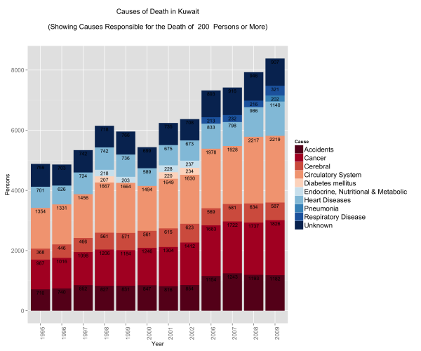
I always had the impression that the biggest issues with mortality in Kuwait were car accidents. Perhaps this is a bias introduced by media coverage. I always thought that if someone managed to survive their entire lives in Kuwait without dying in an accident, then only one other thing could get them ~ and that was cancer. This is not far from the truth:
What did catch me off guard is the number of people who die from circulatory system disease and heart disease. The numbers are not only large, but the trump both accidents and cancer figures. Interestingly enough, respiratory system diseases start to show up in 2006 just as problems with circulatory and pulmonary problems become more prevalent.
I thought that this surely is controlled within a demographic group.
So I decided to split the data into gender and age.
Causes of Death by Gender
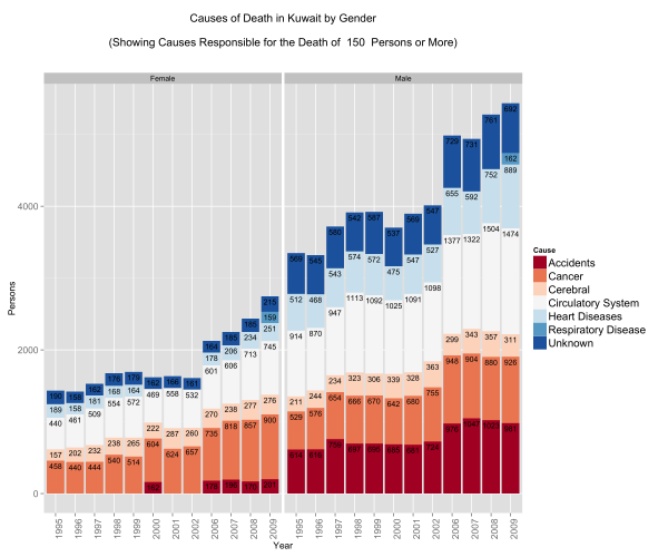
Looking at the gender differences the first eye-popping fact is that less women seem to be dying … this is misleading because the population is generally bias towards men. There are about 9 men for every 5 women in Kuwait.
The other eye-popping item that appears is in accidents. Less women pass away from accidents compared to men – a lot less! Is this indicative that women are safer drivers than their counterparts? Perhaps. In some nations this figure would indeed be zero because of social and legal constraints … it’s not necessarily good news … but it does stand out!
Proportionally there is a higher rate of mortality due to cancer in the female population vs. the male population.
Lastly, men seem to be more susceptible to death from heart diseases and circulatory system diseases. This might make you think why? Heart diseases and circulatory system diseases are exacerbated by sedentry life styles, poor diets, and other factors such as the consumption of tobacco. We have already looked at obesity in Kuwait … perhaps a deeper dive might shed some light on this matter.
For now, lets move on … surely younger people do not suffer from heart diseases …
Causes of Death by Age Group
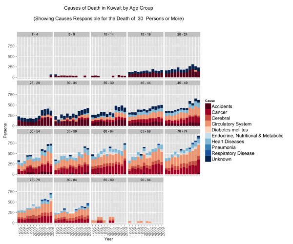
This one confirms that if an accident does not get you before you’re 25 then the rest of the diseases are coming your way.
People fall victim to circulatory, respiratory, and heart diseases at extremely young ages. In fact what we see here is that irrespective of age group, after the age of 40 the mortality rates are the same for these three diseases.
On the other hand, accident mortalities go down as people shift to older age groups but are displaced by cancer. What is terribly depressing about this graph are the number of people below the ages of 19 that die in accidents. These might be just numbers, but in reality these are very real names to families.
Take-aways
The graphs were just a fun way to play with R. What we can take away is that of the 5 main causes for mortality in Kuwait – Cancer, Heart Diseases, Circulatory Diseases, Respiratory Diseases, and Accidents – 4 of them are addressible through policy, regulation, and raising public awareness for social/behavioural impact.
Code
You can download the Kuwait dataset here or from the UN’s Data Portal.
Load up R and run the code below – fully commented for your geeky enjoyment:
# In Libraries we Trust library(ggplot2) library(dplyr) # Read Data data.mortality<-read.csv('kuwait.csv') ################## # Data Munging # ################## # Change Year into a categorical variable data.mortality$Year<-as.factor(data.mortality$Year) # Rename our columns names(data.mortality)<-c("Country","Year","Area","Sex","Age","Cause","Record","Reliability","Source.Year","Value","Value.Notes") # Data cleaning, here we groups some items together for simplification. # Eg. All forms of neoplasms are grouped under "Cancer". data.mortality$Cause<-gsub(pattern=", ICD10","",x=data.mortality$Cause) data.mortality[grep(pattern="eoplasm",x=data.mortality$Cause),]$Cause<-"Cancer" data.mortality[grep(pattern="ccidents",x=data.mortality$Cause),]$Cause<-"Accidents" data.mortality[grep(pattern="not elsewhere classified",x=data.mortality$Cause),]$Cause<-"Unknown" data.mortality[grep(pattern="External causes",x=data.mortality$Cause),]$Cause<-"Unknown" data.mortality[grep(pattern="Congenital malformations",x=data.mortality$Cause),]$Cause<-"Congenital malformations" data.mortality[grep(pattern="Certain conditions originating in the perinatal period",x=data.mortality$Cause),]$Cause<-"Perinatal period conditions" data.mortality[grep(pattern="Endocrine, nutritional and metabolic",x=data.mortality$Cause),]$Cause<-"Endocrine, Nutritional & Metabolic" data.mortality[grep(pattern="Diseases of the respiratory",x=data.mortality$Cause),]$Cause<-"Respiratory Disease" data.mortality[grep(pattern="Diseases of the circulatory system",x=data.mortality$Cause),]$Cause<-"Circulatory System" data.mortality[grep(pattern="Hypertensive diseases",x=data.mortality$Cause),]$Cause<-"Cerebral" data.mortality[grep(pattern="Ischaemic heart diseases",x=data.mortality$Cause),]$Cause<-"Heart Diseases" data.mortality[grep(pattern="Cerebrovascular diseases",x=data.mortality$Cause),]$Cause<-"Cerebral" ######################### # Data Transformations # ######################### # Use the dplyr library to group items from the original data set # We want a general understanding of causes of death # We subset out All causes to avoid duplication # We subset out age groups that cause duplication # We group by Country, Year and Cause # We create a summary variable "Persons" that is the sum of the incidents # We sort by Cause for pretty graphs kw.general <- data.mortality %.% subset(!(Cause %in% "All causes")) %.% subset(Country %in% "Kuwait") %.% subset(!(Age %in% c("Total","Unknown","85 +","95 +","1","2","3","4","0"))) %.% group_by(Country) %.% group_by(Year) %.% group_by(Cause) %.% summarise(Persons=sum(Value)) %.% arrange(Cause) # We want an understanding of causes of death by age group # We subset out All causes to avoid duplication # We subset out age groups that cause duplication # We group by Country, Year, Age and Cause # We create a summary variable "Persons" that is the sum of the incidents # We sort by Cause for pretty graphs kw.age<-data.mortality %.% subset(!(Cause %in% "All causes")) %.% subset(Country %in% "Kuwait") %.% subset(!(Age %in% c("Total","Unknown","85 +","95 +","1","2","3","4","0"))) %.% group_by(Country) %.% group_by(Year) %.% group_by(Age) %.% group_by(Cause) %.% summarise(Persons=sum(Value)) %.% arrange(Cause) # We reorder our age groups manually for pretty graphs kw.age$Age<-(factor(kw.age$Age,levels(kw.age$Age)[c(1,2,6,9,12,3,15,4,5,7,8,10,11,13,14,16:28)])) # We want an understanding of causes of death by gender # We subset out All causes to avoid duplication # We subset out age groups that cause duplication # We group by Country, Year, Gender and Cause # We create a summary variable "Persons" that is the sum of the incidents # We sort by Cause for pretty graphs kw.sex<-data.mortality %.% subset(!(Cause %in% "All causes")) %.% subset(Country %in% "Kuwait") %.% subset(!(Age %in% c("Total","Unknown","85 +","95 +","1","2","3","4","0"))) %.% group_by(Country) %.% group_by(Year) %.% group_by(Sex) %.% group_by(Cause) %.% summarise(Persons=sum(Value)) %.% arrange(Cause) ######################################## # Graphing, Plotting, Dunking Cookies # ######################################## # We will limit our graphs by number of persons each incidents cause # The main reason is because we do not want a graph that looks like a chocolate chip cookie PersonLimit <- 200 # Plot the General data General<-ggplot(subset(kw.general,Persons>=PersonLimit), aes(x = Year, y = Persons)) + geom_bar(aes(fill=Cause),stat='identity', position="stack")+ ggtitle(paste("Causes of Death in Kuwait\n\n(Showing Causes Responsible for the Death of ",PersonLimit," Persons or More)\n\n"))+ theme(axis.text.x = element_text(angle = 90, hjust = 1), legend.text=element_text(size=14), axis.text=element_text(size=12), axis.title=element_text(size=12))+ scale_fill_brewer( palette = "RdBu")+ geom_text(aes(label = Persons,y=Persons,ymax=Persons), size = 3.5, vjust = 1.5, position="stack",color=I("#000000")) # Reset the Person Limit PersonLimit <- 150 # Plot the Gender data faceted by Gender Gender<-ggplot(subset(kw.sex,Persons>=PersonLimit), aes(x = Year, y = Persons)) + geom_bar(aes(fill=Cause),stat='identity', position="stack")+ facet_wrap(~Sex)+ ggtitle(paste("Causes of Death in Kuwait by Gender\n\n(Showing Causes Responsible for the Death of ",PersonLimit," Persons or More)\n\n"))+ theme(axis.text.x = element_text(angle = 90, hjust = 1), legend.text=element_text(size=14), axis.text=element_text(size=12), axis.title=element_text(size=12) )+ scale_fill_brewer( palette = "RdBu" )+ geom_text(aes(label = Persons,y=Persons,ymax=Persons), size = 3.5, vjust = 1.5, position="stack",color=I("#000000")) # Reset the Person Limit PersonLimit <- 30 # Plot the Age group data facted by Age Age<-ggplot(subset(kw.age,Persons>=PersonLimit), aes(x = Year, y = Persons)) + geom_bar(aes(fill=Cause),stat='identity', position="stack")+ facet_wrap(~Age)+ ggtitle(paste("Causes of Death in Kuwait by Age Group\n\n(Showing Causes Responsible for the Death of ",PersonLimit," Persons or More)\n\n"))+ theme(axis.text.x = element_text(angle = 90, hjust = 1), legend.text=element_text(size=14), axis.text=element_text(size=12), axis.title=element_text(size=12) )+ scale_fill_brewer( palette = "RdBu" ) # Save all three plots ggsave(filename="General.png",plot=General,width=12,height=10) ggsave(filename="Age.png",plot=Age,width=12,height=10) ggsave(filename="Gender.png",plot=Gender,width=12,height=10) |
![]() Jun 10
Jun 10
Price Elasticity with R

Scenario
We covered Price Elasticity in an accompanying post. In this post we will look at how we can use this information to analyse our own product and cross product elasticity.
The scenario is as follows:
You are the owner of a corner mom and pop shop that sells eggs and cookies. You sometimes put a poster on your storefront advertising either your fresh farm eggs, or your delicious chocolate chip cookies. You are particularly concerned with the sales off eggs – your beautiful farm chicken would be terribly sad if they knew that their eggs were not doing so well.
Over a one month period, you collect information on sales of your eggs and the different prices you set for your product.
Data Time
We are using a modified version of Data Apple‘s data set.
You can download the supermarket data set here. In it you will find:
- Sales: the total eggs sold on the given day
- Price Eggs: the price of the eggs on the day
- Ad Type: the type of poster – 0 is the egg poster, 1 is the cookie poster.
- Price Cookies: the price of cookies on the day
Lets fire up R and load up the data
# Load data and output summary stats sales.data<-read.csv('supermarket.csv') #Look at column names and their classes sapply(sales.data,class) |
The output shows each column and its type:
Sales Price.Eggs Ad.Type Price.Cookies "integer" "numeric" "integer" "numeric" |
Since Ad.Type is a categorical variable, lets go ahead and change that and output the summary statistics of our dataset.
# Change Ad Type to factor sales.data$Ad.Type<-as.factor(sales.data$Ad.Type) summary(sales.data) |
From the results we find that:
- Sales of eggs ranged between 18 and 46
- Price of eggs ranged between $3.73 and $4.77
- We showed the egg poster 15 times and the cookies poster 15 times
- Price of cookies ranged between $4 and $4.81
Sales Price.Eggs Ad.Type Price.Cookies Min. :18.0 Min. :3.73 0:15 Min. :4.00 1st Qu.:25.2 1st Qu.:4.35 1:15 1st Qu.:4.17 Median :28.5 Median :4.48 Median :4.33 Mean :30.0 Mean :4.43 Mean :4.37 3rd Qu.:33.8 3rd Qu.:4.67 3rd Qu.:4.61 Max. :46.0 Max. :4.77 Max. :4.81 |
Right now we want to see if we can predict the relationship between Sales of Eggs, and everything else.
Regression … the Granddaddy of Prediction
We now want to run a regression and then do some diagnostics on our model before getting to the good stuff.
We can run the entire regression or add each variable to see the impact on the regression model. Since we have few predictors lets choose the latter option for fun.
# Create models m1<-lm(formula=Sales~Price.Eggs,data=sales.data) m2<-update(m1,.~.+Ad.Type) m3<-update(m2,.~.+Price.Cookies) mtable(m1,m2,m3) |
The results are pasted below. We end up with a model “m3” that has statistically significant predictors. Our model is:
Sales of Eggs = 137.37 – (16.12)Price.Eggs + 4.15 (Ad.Type) – (8.71)Price.Cookies
We look at our R2 and see that the regression explains 88.6% of the variance in the data. We also have a low mean squared error (2.611) compared to the other models we generated.
We can actually get better results by transforming our independent and dependent variables (e.g. LN(Sales)) but this will suffice for demonstrating how we can use regressions to calculate price elasticity.
Calls: m1: lm(formula = Sales ~ Price.Eggs, data = sales.data) m2: lm(formula = Sales ~ Price.Eggs + Ad.Type, data = sales.data) m3: lm(formula = Sales ~ Price.Eggs + Ad.Type + Price.Cookies, data = sales.data) ------------------------------------------------ m1 m2 m3 ------------------------------------------------ (Intercept) 115.366*** 101.571*** 137.370*** Price.Eggs -19.286*** -16.643*** -16.118*** Ad.Type: 1/0 4.195** 4.147*** Price.Cookies -8.711*** ------------------------------------------------ R-squared 0.722 0.793 0.886 adj. R-squared 0.712 0.778 0.872 sigma 3.924 3.444 2.611 ... ------------------------------------------------ |
Diagnostics
We need to test for the following assumptions whenever we do regression analysis:
1. The relationship is linear
2. The errors have the same variance
3. The errors are independent of each other
4. The errors are normally distributed
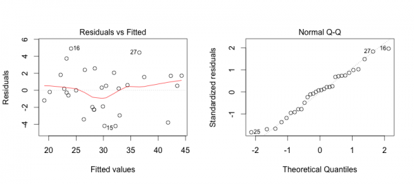
First, we can address some of these points by creating plots of the model in R.
The plot on the left shows that the residuals (errors) have no pattern in variance (Good!).
The red line is concerning because it shows some curvature indicating that perhaps the relationshp is not entirely linear (hmmm…).
On the right we see that the errors are acceptably normally distributed (they are around the straight line … Good!).
To generate this plot you can use the R code below:
# Linearity Plots par(mfrow=c(1,2)) plot(m3) # Reset grid par(mfrow=c(1,1)) |
So we want to look deeper into linearity issues. We will look at multi-colinearity first:
# Multi-collinearity library(car) vif(m3) # variance inflation factors sqrt(vif(m3)) > 2 # problem? |
The code above will show if any of the variables have multicolinearity issues that could cause issues with the model’s integrity. Generally we want values less than 2, and we have values of around 1 so we are good on this front.
Price.Eggs Ad.Type Price.Cookies 1.195107 1.189436 1.006566 |
We can generate a CERES plot to assess non-linearity:
# Diagnosis: Nonlinearity crPlots(m3) |
We see that there is definitely some issues with linearity but not to an extent that it is a cause for concern for the purpose of demonstration. So we keep calm, and move on.
Lastly we want to test independence of the residuals using the Durban Watson Test:
# Diagnosis: Non-independence of Errors durbinWatsonTest(m3) |
The output shows that there is no autocorrelation issues in the model:
lag Autocorrelation D-W Statistic p-value 1 0.06348248 1.792429 0.458 Alternative hypothesis: rho != 0 |
So we are clear to move forward with Price Elasticity and Cross Product Price Elasticity!
Price Elasticity
We now have our model:
Sales of Eggs = 137.37 – (16.12)Price.Eggs + 4.15 (Ad.Type) – (8.71)Price.Cookies
Own Price Elasticity
To calculate Price Elasticity of Demand we use the formula:
PE = (ΔQ/ΔP) * (P/Q)
(ΔQ/ΔP) is determined by the coefficient -16.12 in our regression formula.
To determine (P/Q) we will use the mean Price (4.43) and mean Sales (30).
Therefore we have PE = -16.12 * 4.43/30 = -2.38
This means that an increase in the price of eggs by 1 unit will decrease the sales by 2.38 units.
Cross Price Elasticity
To calculate Cross Price Elasticity of Demand we are essentially looking for how the price of cookies impacts the sales of eggs. So we use the formula:
CPEcookies = (ΔQ/ΔPcookies) * (Pcookies/Q)
We know from our regression that (ΔQ/ΔPcookies) is the coefficient of Price of Cookies (-8.71).
We use the mean price of cookies and mean sales for the rest of the formula giving (4.37/30)
CPEcookies = -8.71 * (4.37/30) = -1.27
This means that an increase in the price of cookies by 1 unit will decrease the sales of eggs by 1.27 units.
Interpretation
We now know that the price of eggs and price of cookies are complementary to one another in this scenario. Since you only sell too products, one explanation could be that people who come in for cookies and eggs would rather get them elsewhere if the price is too high.
Also, it means that if you had to choose between a price cut on cookies or eggs, go with cookies!
Next steps
You are now in an ideal situation where you can run an optimization function to set the right price for both cookies and eggs.
This is out of the scope of this post, but if you’re interested in doing that check out R’s optim() function ~ or leave a comment below 😛
Bonus
Can you figure out what to do with the Ads?
I’ve included some ideas in the complete code below:
################################### # Warm-up ... data and stuff # ################################### # Load data and output summary stats sales.data<-read.csv('supermarket.csv') #Look at column names and their classes sapply(sales.data,class) # Change Ad.Type to factor and print Summary Stats sales.data$Ad.Type<-as.factor(sales.data$Ad.Type) summary(sales.data) #################### # Create Models # #################### # Load required library library(memisc) # Create models m1<-lm(formula=Sales~Price.Eggs,data=sales.data) m2<-update(m1,.~.+Ad.Type) m3<-update(m2,.~.+Price.Cookies) mtable(m1,m2,m3) #################### # DIAGNOSTICS # #################### # Linearity Plots par(mfrow=c(1,2)) plot(m3) par(mfrow=c(1,1)) # Multi-collinearity library(car) vif(m3) # variance inflation factors sqrt(vif(m3)) > 2 # problem? # Diagnosis: Nonlinearity crPlots(m3) # Diagnosis: Non-independence of Errors # We want a D-W Statistic close to 2 durbinWatsonTest(m3) ######################### # Price Elasticity # ######################### # Calculate Price Elasticity PE<-as.numeric(m3$coefficients["Price.Eggs"] * mean(sales.data$Price.Eggs)/mean(sales.data$Sales)) CPEcookies<-as.numeric(m3$coefficients["Price.Cookies"] * mean(sales.data$Price.Cookies)/mean(sales.data$Sales)) # Print Results PE CPEcookies #################################### # BONUS - What about the ads? # #################################### # Subset the data sales.adEggs <- subset(sales.data,Ad.Type==0) sales.adCookies <- subset(sales.data,Ad.Type==1) # Diagnostic on subsets' means and if they are different ... they are. wilcox.test(x=sales.adCookies$Sales,y=sales.adEggs$Sales,exact=F,paired=T) # On average, does the advert for eggs generate higher sales for eggs? mean(sales.adEggs$Sales) >= mean(sales.adCookies$Sales) |


Chatter