Food and Money: A Short Story
Every year, around June, I start looking for behavioural trends in my spending pattern. Often I find that my spending on particular category tells a story … and what better story than that of food. Unsurprisingly, over 50% of all my expenditure is on food.
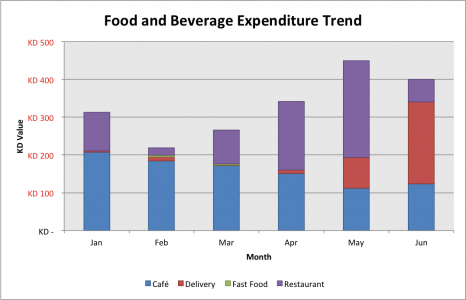
The graph above shows that I barely spend anything on fast food; I’m health conscious. I was a little naught in February and March, but if you look into the details of those you’ll find that I ate Subway in Feb … I gouged down Tikka in March so no excuses there.
The interesting bit is the frequency at which I visit Cafe’s has decreased. This is especially true in May. This is mainly because I was enrolled in a course and ended up having to avoid cafe socialising to study. This correlates to the ridiculous jump in delivery food I ordered … clearly home cooking has much to be desired still :'(
I also spent a lot more in restaurants in April and May; this is ironically because of the number of celebrations.
It looks like June is going to be a contender on spending at Cafe’s and Delivery. I expect to frequent Cafe’s a lot more however, now that I can lounge around for a bit.
I need to spend less on eating out, at least shave the figure down to what it was in January … the heat must be making me hungry >.<' Interested in learning how to keep track of your spending? Leave a comment.


Can’t say no to cookies.
Wow ! This is brilliant but weird.
@Jazi ;] thanks, its been a few months and I have new data on my personal spending that I’ll post up ~ it’s funny how patterns emerge even with a relatively unplanned life 😛
Pingback: Salem Marafi » How I Spent 2011 – Literally.